


"The red-room was a square chamber, very seldom slept in...yet it was one of the largest and stateliest chambers in the mansion...This room was chill, because it seldom had a fire; it was silent, because remote from the nursery and kitchen; solemn, because it was known to be so seldom entered...Mrs. Reed herself, at far intervals, visited it to review the contents of a certain secret drawer in the wardrobe, where were stored divers parchments, her jewel-casket, and a miniature of her deceased husband; and in those last words lies the secret of the red-room--the spell which kept it so lonely in spite of its grandeur...All looked colder and darker in that visionary hollow than in reality..." Charlotte Bronte, Jane Eyre, (my favorite novel)
So we are returning to my red room, and, as you can see, I have not painted it yet. I loved reading all of your comments in response to my post about wanting to change the color, but one comment, in particular, stood out to me and made me pause and ponder whether or not I really wanted to delete the red. Annie from Knitsofacto wrote...
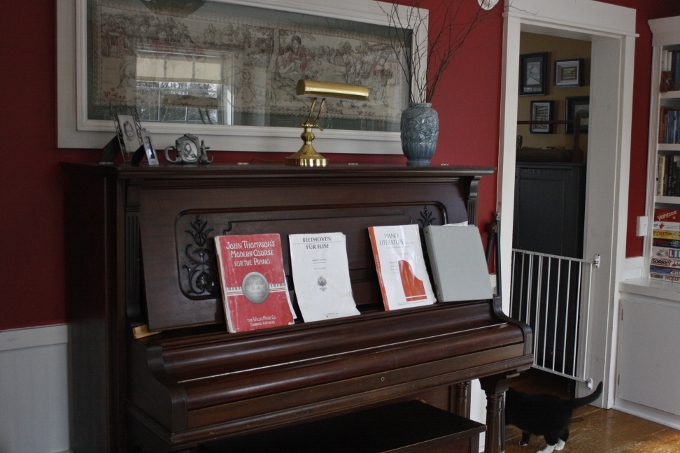
"I rather like your red piano room ... there is so much pale painted wood or whatever in there that it balances the red, which in turn adds to the richness of all those books and your lovely piano. This is possibly going to sound daft and presumptive, but maybe wait until all the snow has gone and your eyes adjust from living in a sea of white before you make any decisions?"
Annie has a lovely blog in which her artistic beauty shines through in her photography and yarn dyeing. She also posts a lovely Color Collaborative post each month, and I especially like the one she did for March. Her experience with color made her comment even more thought-provoking. I asked Hubby to hold off on buying the paint, and I decided to take Annie's advice and wait a bit before making the change. I spring cleaned the room by washing the windows, vacuuming the cobwebs, wiping down the walls and trim, dusting the bookshelves and sorting through the books, donating the ones we no longer wanted to keep. I removed the storage boxes from the top of the shelves and decluttered the top of the piano, replacing the dusty, old, dried hydrangeas with a few fresh twigs from the yard. I hung a pair of sheer curtains that I already had in one window to see if I liked them in the room before purchasing new ones. I was afraid they might make the room feel heavier, but they do just the opposite. The curtains seem to tone down the red and give the room a much lighter, airier feeling, and they diffuse the light perfectly, giving the room a softer more soothing effect. (By the way, did you notice the open window? Saturday was a pleasantly warm, almost spring-like day. Now if we could just get rid of some snow.) I think I would prefer the curtains to be a bit less "fluffy", and am leaning towards cotton gauze, maybe in tab top, like these. What do you think?
I would LOVE your input! Should I paint? Should I leave the red? Curtains? No curtains? Should I slip-cover the chair? If so, what color would you choose? I would love to know what YOU would do. Did cleaning and decluttering the room make a difference or does it really need a color make-over?
So we are returning to my red room, and, as you can see, I have not painted it yet. I loved reading all of your comments in response to my post about wanting to change the color, but one comment, in particular, stood out to me and made me pause and ponder whether or not I really wanted to delete the red. Annie from Knitsofacto wrote...
"I rather like your red piano room ... there is so much pale painted wood or whatever in there that it balances the red, which in turn adds to the richness of all those books and your lovely piano. This is possibly going to sound daft and presumptive, but maybe wait until all the snow has gone and your eyes adjust from living in a sea of white before you make any decisions?"
Annie has a lovely blog in which her artistic beauty shines through in her photography and yarn dyeing. She also posts a lovely Color Collaborative post each month, and I especially like the one she did for March. Her experience with color made her comment even more thought-provoking. I asked Hubby to hold off on buying the paint, and I decided to take Annie's advice and wait a bit before making the change. I spring cleaned the room by washing the windows, vacuuming the cobwebs, wiping down the walls and trim, dusting the bookshelves and sorting through the books, donating the ones we no longer wanted to keep. I removed the storage boxes from the top of the shelves and decluttered the top of the piano, replacing the dusty, old, dried hydrangeas with a few fresh twigs from the yard. I hung a pair of sheer curtains that I already had in one window to see if I liked them in the room before purchasing new ones. I was afraid they might make the room feel heavier, but they do just the opposite. The curtains seem to tone down the red and give the room a much lighter, airier feeling, and they diffuse the light perfectly, giving the room a softer more soothing effect. (By the way, did you notice the open window? Saturday was a pleasantly warm, almost spring-like day. Now if we could just get rid of some snow.) I think I would prefer the curtains to be a bit less "fluffy", and am leaning towards cotton gauze, maybe in tab top, like these. What do you think?
I would LOVE your input! Should I paint? Should I leave the red? Curtains? No curtains? Should I slip-cover the chair? If so, what color would you choose? I would love to know what YOU would do. Did cleaning and decluttering the room make a difference or does it really need a color make-over?
i love this room..
ReplyDeleteIf that is the comment that stood out to you, probably wait. There is a lot of light and white in there for brightness, and the red really does meld nicely with the richness of the piano and books. When I had a red room, there was little white and bright in it (also the red was darker, I'll be posting of bit of it this week...hopefully), and it was a cave. Yours is not like that at all. Don't change it just because "everybody" is lightening up their colors and losing their reds, though. If it is a color *you* love, keep it! Many rooms were red merely for the fad of it. I still love the red we had, it was just too dark for where it was. Slip-covering the chair could be a good thing, though! No matter what, it is already beautiful, but I completely sympathize with freshening a place up!
ReplyDeleteI'm not a big fan of red anymore...like I mentioned before, I think I have red-overload, but I think it works in this room since, like you pointed out, it is so bright and sunny. Thanks for sharing your opinion with me, Michelle. :)
DeleteI think the dark piano looks nice against the red. And for some reason I think a library room should be a darker color; I would keep the read. I think a large room of it would be oppressive, but with the white accents, I think it looks good.
ReplyDeleteYou are right about a library being a darker color...another good point. :) Thanks!
DeleteI loved it before and I love it now. It is hard to tell from your pictures but it looks like there is not a huge amount of visible wall and therefore the red does not really dominate. Personally I like rich deep colours on my walls when there is not a lot of it visible. My kitchen is painted a similar colour which sounds horrible, but I don't have a huge amount of visible wall and what there is is small patches.
ReplyDeleteI would keep it as it is but I am not a fan of pale colours so maybe I am not the best person to ask!
I think your advise is great! You are right about there not being a lot of wall space; therefore, the red is not dominating...actually there is probably more white than there is red. Very good point! The lighter color may actually get washed out by all of the white. Thank you!
DeleteThat last thought of yours is one of the things that I had in mind when I commented originally. The room as it is has a richness that comes from contrast, so losing the red and replacing it with something that can't compete with the white will, I think, leave everything looking washed out. If you really want to replace the red I'd say you need to do so with an equally robust colour.
DeleteFirst off, great post title and quote! Very dramatic! And I think that comment is very sensible, if you're in doubt wait. It's hard to judge purely from photos but I don't dislike the red, I'm sure it looks lovely and it certainly doesn't look dark and gloomy, and all the other comments are very valid. But my vote would still go for the mellower greys you were looking at. My sister-in-law has recently decorated a room in those tones, with white woodwork and it looks gorgeous, incredibly light and airy and relaxing and very timeless. I've had some bright walls in my time (a really bright orange bathroom, bright green bedroom, bright yellow kitchen...!) and I'm just not such a fan anymore. Personally I'd rather not have such a contrast between the red and white, and I'd rather have a more neutral back drop that I can influence with pictures, vases, cushions, quilts etc to add colour pops as I fancy them, and then change these according to season/mood etc. But all that is just a personal preference. What do your family think? And if you're the sole decision maker (that's how it works in my house!) then I think you just have to go with your gut. (The greys look to me more in keeping with the rest of your house too!)
ReplyDeleteJane Eyre is my favourite of all the Bronte's novels, I must have read it tens of times over the years.
ReplyDeleteThese are such hard questions. I find choosing colours very difficult. We recently painted the bathroom three times because we got the colour wrong and couldn't live with it. Fortunately it's a very small room and Oxford has a recycling store where people bring their unwanted/left-over paint. Often the Interior Designers/ decorators bring amazing stuff. We have in the past found treasures there like Farrow and Ball estate paint.
I'm naturally drawn to cool greys and greens, my husband too. I find them very calming, so we usually go down that path. Having said that I think the red works really well here and I've been contemplating a rust or mustard wall for a change when we move. I like rooms to have different personalities.
Sorry I'm not helping at all am I?
I do think though that if you are doubtful it is best to take some time. My father always used to say to me "If in doubt, don't" That's usually worked for me.
What I have done in the past is to take a large piece of paper, maybe lining wall paper and paint with a sample of a new colour. As large an area as possible and then stick it with masking tape and leave it for a little while. Live with it and see how I feel a few days later.
The filmy curtains sound good.
I was thinking you might paint it some shade of gray......................that is sort of popular these days. Just a thought.
ReplyDeleteKim
Oh - paint it!!! Paint it the cool, creamy green on the swatch. Red is lovely, but it's big and hungry and kind of angry and all those red-ish things...
ReplyDeleteFarrow and Ball has a beautiful green on their palette. Maybe...
I also like the green idea!
ReplyDeleteKim
You can probably guess I'd keep the red! And those curtains, or something similar, love that look. But I also think I'd make a pale grey linen slip cover for the chair and introduce a few pale grey accents throughout the room to soften the look a bit more.
ReplyDeleteBut you have to live with it so only you can really know what will work ... maybe what exactly to change will become clear to you given a little more time.
Thank you for the mention and your sweet words x